Why castle hotel paint colour restoration heritage matters to your stay
Walk into a serious castle hotel and the walls speak first. Their paint colour, quietly calibrated through years of careful restoration and heritage consultation, frames every arrival, meeting and late night email. Guests rarely see the project files, yet they feel the decisions in how a building breathes and how a room holds the light.
Across leading castle hotels in Europe and beyond, management teams now treat each restoration project as both a conservation duty and a hospitality strategy, because the chosen colour palette shapes perceived room size, temperature and even how long guests linger in the bar. Historic preservationists, interior designers and hotel management form a tight équipe, weighing archival evidence against guest expectations and long term maintenance. When this team gets the palette wrong, a medieval wing can feel like a themed pub; when they get it right, the castle feels inevitable, not theatrical.
For business leisure travelers, the nuance matters because you are buying atmosphere as much as a bed. A castle hotel that invests in rigorous paint archaeology, rather than quick cosmetic renovation, usually signals a broader policy of respect for heritage and guest safety. Before you book, read the hotel blog or heritage pages to find how openly they discuss colour research, conservation partners and the balance between historic buildings and modern comfort. Properties such as Ashford Castle in Ireland or Parador de Cardona in Spain have publicly shared restoration notes and conservation awards, giving you a window into how seriously they treat their role as custodians.
From paint archaeology to guest room: how colours are actually chosen
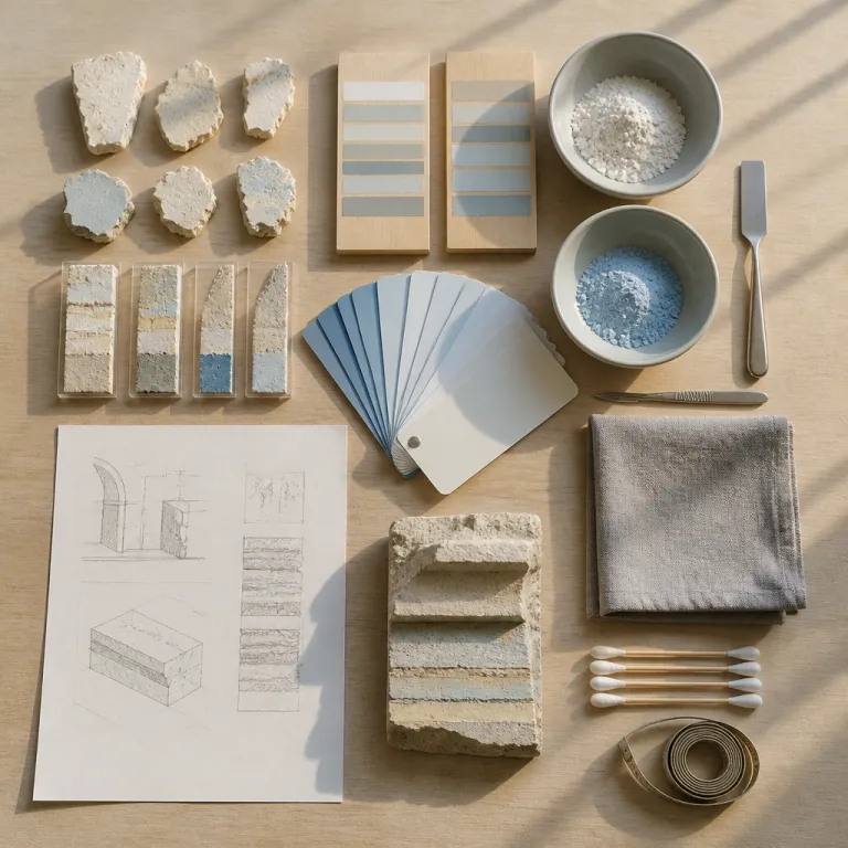
Behind every apparently effortless castle corridor lies a forensic colour project. Conservators scrape back millimetres of paint to find the earliest surviving layers, then use microscopy and pigment analysis to understand what once covered the building walls. This is the quiet, painstaking side of castle hotel paint colour restoration heritage work, far removed from mood boards and marketing shots.
In many serious renovations, the process follows a clear sequence: research historical records, consult experts, test samples on site, then finalize colours with hotel management. One expert style summary used internally across several properties is blunt and useful for guests to know: "How do castle hotels choose paint colors?" "Through historical research and expert consultation." "Why is color selection important in castle hotels?" "To maintain historical authenticity and enhance ambiance." "Do castle hotels use original paint colors?" "Often, they replicate original colors using modern materials." When a castle hotel shares this level of method on its blog, it usually indicates a mature approach to heritage and design governance.
A micro-case from a Scottish property illustrates the trade-offs. During a 2018 refurbishment of a 19th-century wing, conservators reportedly uncovered an original arsenic-based green in a drawing room. The hue was historically accurate but toxic and visually heavy in a compact 20 square metre space used by jet lagged executives. Working with guidance from Historic Environment Scotland, the team commissioned a modern, low-VOC match that softened the saturation by around 20 percent. The result kept the period character while meeting current health, safety and comfort expectations.
Period palettes, modern ranges and the psychology of colour
Each architectural era brought its own disciplined palette, and serious castle hotels respect those boundaries. Medieval spaces often used limewash whites with mineral tints, while Georgian rooms leaned towards restrained blues and green shades that flatter natural light. Victorian wings, by contrast, embraced saturated colour, with claret dining rooms and gold accented libraries that can feel either sumptuous or stifling depending on the design choices.
Today, heritage bodies such as English Heritage or the National Trust usually approve period appropriate colour ranges rather than insisting on exact pigment matches, which gives designers room to negotiate between authenticity and guest psychology. A thoughtful castle hotel might keep a medieval great hall in deep, shadowed tones, then shift to a softer green range in guest corridors to avoid fatigue during a long stay. This is where contemporary design intelligence, like the Danish sensitivity to light and texture explored in recent analyses of how Danish designers are reshaping castle interiors, becomes a quiet ally to conservation.
Psychologically, darker colours can make a room feel smaller yet more secure, while pale tones expand perceived volume but risk erasing character. Business travelers often prefer a calm, cool colour palette in bedrooms, then accept richer hues in the bar or library where they unwind after meetings. When you tour a castle, notice how the palette changes between public buildings, private suites and transitional spaces; that gradient usually reveals how deeply the team has thought about your day long journey through the hotel.
Guest expectations, safety policies and the realities of working castles
Most guests say they want authenticity, yet very few truly want medieval levels of gloom. Castle hotel paint colour restoration heritage therefore becomes a negotiation between what once was and what feels plausibly historic to a traveler arriving with a laptop and carry on. The most successful properties accept that guests prefer rooms that feel historic rather than rooms that are archaeologically exact.
Safety and policy constraints also shape every paint decision, from fire ratings to off gassing standards that protect indoor air quality. A conservation focused project might specify mineral paints for stone walls in public buildings, then switch to high performance emulsions in stairwells to meet strict safety codes. Serious hotels publish at least a basic privacy policy and terms of use statement that explain how they manage guest données, and the same governance mindset often extends to how they document materials, maintenance cycles and renovation impacts.
For travelers, a few quick checks reveal whether a castle hotel balances romance with responsibility. Look for clear renovation timelines, references to conservation specialists and mention of eco friendly or low VOC paints in sustainability sections. When a hotel explains its paint choices alongside fire safety upgrades and accessibility improvements, you can usually trust that the team treats the entire building as a long term project rather than a short term backdrop.
Where colour meets experience: reading rooms, pubs and the quiet corners
The most revealing spaces in any castle hotel are rarely the suites. Instead, look to the library, the bar and the tucked away pub style lounges where guests actually linger. In these rooms, castle hotel paint colour restoration heritage moves from theory to lived experience.
Consider the new generation of castle libraries, where walls in deep green or inky blue make leather bindings glow and laptop screens feel less intrusive. Articles on why the reading room is now the most coveted space show how a carefully tuned colour palette can turn a once forgotten tower into the emotional centre of the hotel. In adjacent bar areas, designers often echo those tones in softer ranges, creating a visual thread that guides you from afternoon emails to a late night whisky without jarring shifts.
Even the most casual pub corner or local facing bar now receives the same level of chromatic attention as a formal dining room. A good team will test how daylight, candlelight and LED spots play across stone, timber and plaster before locking in the final palette. When you next find yourself in a castle, pause in these liminal spaces and ask whether the colours feel inevitable; if they do, you are likely standing in a property where every brushstroke has been argued over, documented and aligned with a long view of heritage.
FAQ
How do castle hotels choose historically appropriate paint colours for guest rooms ?
Serious castle hotels begin with archival research, paint sampling and expert consultation to understand original schemes, then adapt those findings to modern guest expectations. They test several colours on site under different lighting conditions before finalizing a palette that respects the building while supporting comfort. Hotel management usually signs off choices after reviewing input from interior designers, historic preservationists and conservation specialists.
Are the colours I see in a restored castle hotel the original ones ?
Often the colours you see are carefully researched interpretations rather than literal recreations of the first paint layers. Original pigments may be unstable, too dark for contemporary tastes or incompatible with current safety regulations. Many properties therefore replicate historic hues using modern materials that offer better durability, cleanability and fire performance.
Why do some castle hotel corridors feel darker than modern hotels ?
Castle corridors often follow the proportions and window placements of centuries old buildings, which naturally admit less light than contemporary structures. Designers sometimes lean into this by using deeper colours that make the spaces feel intimate rather than trying to fight the architecture with bright whites. Well run properties balance this with strategic lighting and lighter tones at key junctions so guests can navigate comfortably.
What should I look for in a castle hotel if I care about authentic heritage ?
Look for transparent information about restoration work, including mention of paint analysis, conservation partners and phased renovation projects. Hotels that publish detailed heritage or sustainability sections, beyond the standard privacy policy and terms pages, usually take their custodial role seriously. On site, consistent period appropriate colours across public rooms, stairwells and suites are a strong sign of thoughtful planning.
Do heritage paint choices affect room comfort for business travelers ?
Yes, colour directly influences how warm, spacious and restful a room feels after a long workday. Cooler, muted palettes can help regulate perceived temperature and support focus, while overly dark or saturated schemes may feel draining during extended stays. The best castle hotels calibrate tones so rooms read as historic yet remain practical for working, hosting calls and recovering between meetings.